Case · Beverage launch site · United States and Guatemala
A new drink category, explained in one scroll.
A one-page launch site for a new drink category, built to be recognised and remembered rather than to sell.
- What
- beverage launch site
- Where
- United States & Guatemala
- Outcome
- A launch page for a new drink category: the category explained first, three flavours shown as equals, and generated product frames checked against the real packaging. Nothing has been measured, so this record carries no traffic or sales figures, and it will not until there are some.

United States & Guatemala
Ta'Rica
- Country
- United States & Guatemala
- Category
- Beverage launch site
- Scope
- Design → Build
- Build
- One-page launch site
- Based
- United States and Guatemala
- Scope
- Design → Build
- Flavours
- Lemon Lime · Peach · Mango
- Status
- Built and handed over

The product
Hydration Tea
Three flavours. One new category.
Ta'Rica is a new drink whose makers gave its category a name of its own: Hydration Tea. Reidify designed and built the launch site, one continuous responsive page that explains the category, presents Lemon Lime, Peach and Mango as equals, and keeps a quiet email signup under Where to Buy. There is no cart and no checkout, on purpose: the page is built to be recognised and remembered rather than to sell.
A new category has to be explained before it can be chosen.
The category before the product
Nobody searches for a category they have not met yet. The page answers four questions in a fixed order: what it is, why it is different, why it matters, and which flavour to try first. The order is the brand's own message hierarchy, and it was not rearranged for effect.
Three flavours, presented equally
Lemon Lime, Peach and Mango each get the same weight, the same structure and a full-width field in their own colour, so no flavour reads as the main one and the others as extras.
Photography built on the real packaging
Part of the page's photography was generated by Reidify and part is the client's own. Every generated product frame was made from the real packaging files and checked against them label by label before use. A cleanly rendered wrong label is more dangerous than an obviously broken one, so nothing went on the page unchecked.


What the page delivers.
A category, named and explained
Hydration Tea introduced in the brand's own words, ahead of any flavour.
Three equal flavours
Lemon Lime, Peach and Mango, each with its own colour field and the same structure.
Readable before the scripts load
The page is prerendered, so its words are there for search engines and slow connections without JavaScript. Checks for keyboard use, text without scripts, colour contrast and layout ran on every build.
A Where to Buy signup that does not overclaim
It opens an email signup and hands the address to the client's inbox, never claiming a signup it cannot confirm. It is not a store locator.
The build
Recognisable.
One page with one job: to make a new category recognisable, in three flavours, before anyone has to read a label.
Atmosphere
Every visual.
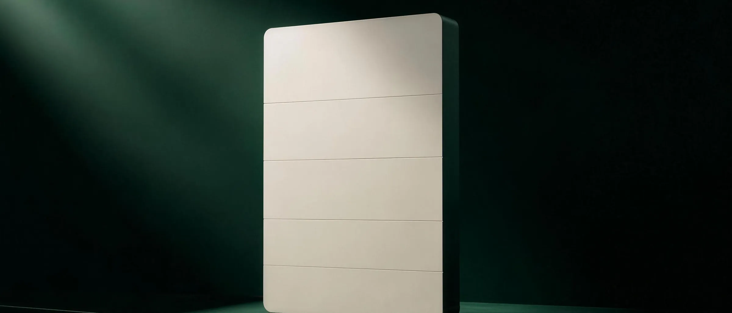
Generated imagery. It carries mood and scale, it is not evidence, and every rail below says so.
Outcome
A launch page for a new drink category: the category explained first, three flavours shown as equals, and generated product frames checked against the real packaging. Nothing has been measured, so this record carries no traffic or sales figures, and it will not until there are some.
15 / 15Next case
All work














15 / 15Next case