

Identity / Engineering
Clarity, engineered.
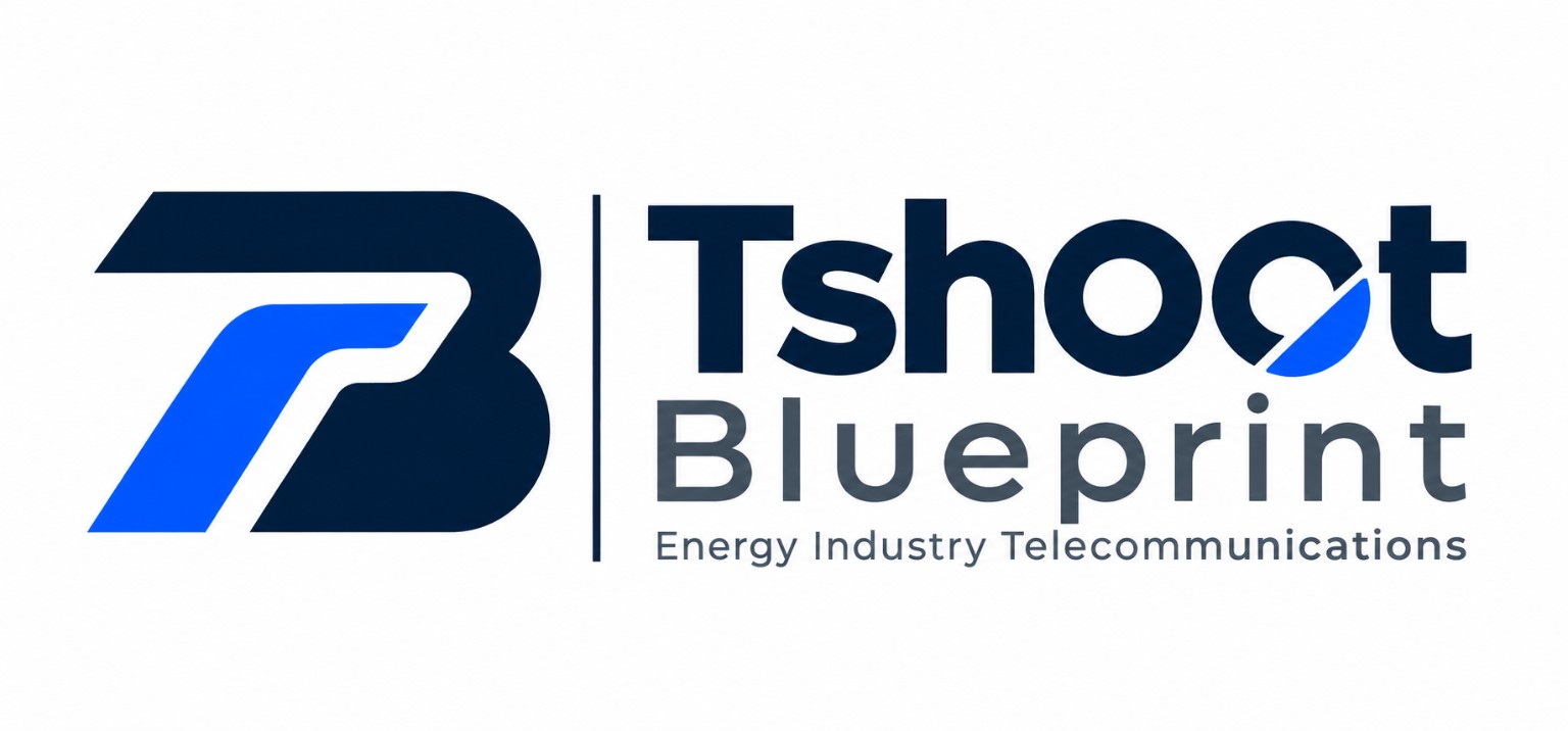
A new visual signature for TshOOt Blueprint, connecting a bold structural symbol with a more focused wordmark.
- Client
- TshOOt Blueprint
- Category
- Brand identity
- Sector
- Energy, infrastructure and telecommunications
- Location
- Burkina Faso
- Year
- 2026
Logo redesign / Visual direction / Typography / Colour exploration
TshOOt Blueprint · Clarity, engineered.
TshOOt Blueprint operates across energy, infrastructure, industrial engineering and telecommunications. Reidify was asked to reconsider its visual identity and create a more contemporary, professional expression of a multidisciplinary technical business.
The aim was not to illustrate every service. It was to build one recognisable visual idea that could carry the brand with clarity.
The challenge
Moving beyond complexity
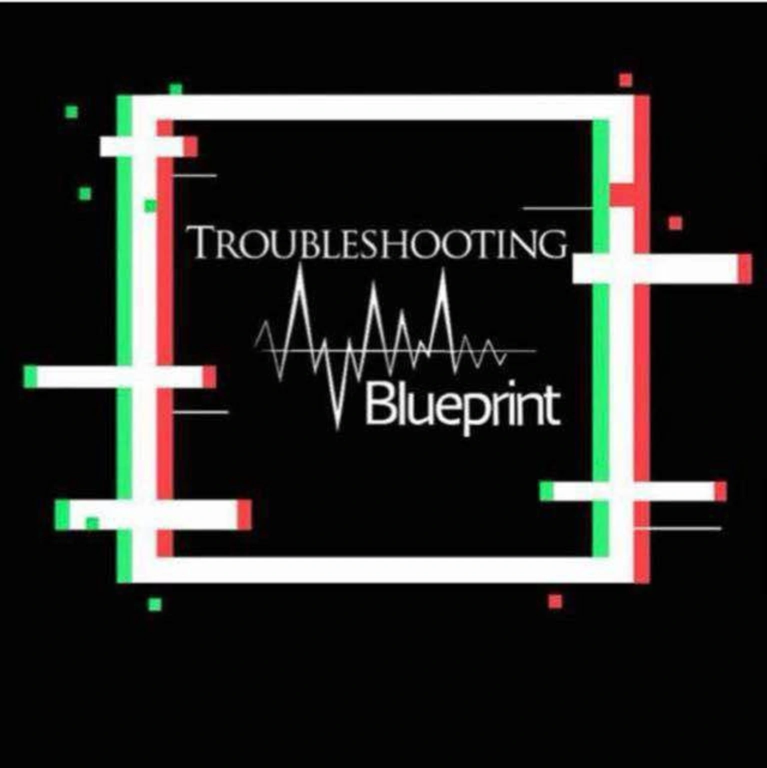
The previous identity brought together a waveform, multiple framing elements and high-contrast red and green accents. Those details established a technical theme, but they competed for attention and made the mark harder to reduce to a single, memorable silhouette.
Our design challenge was to shift the identity from decorative technical symbolism to a more focused, confident form, without losing its engineering character.
What competed for attention
- 01A waveform
- 02Ornamental frame lines
- 03Red and green accents
The exploration
Finding the right visual language
We explored different geometric and typographic directions, including structural letterforms, compact symbols and simplified pathways. Across the studies, the most promising idea was a bold, sculptural form that suggested precision and forward movement without relying on literal equipment icons.
Rather than treating the symbol and typography as separate pieces, we worked toward a shared visual rhythm: clear geometric mass, deliberate negative space and restrained diagonal details.
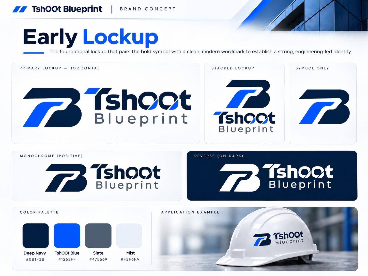
Concept exploration
Early lockup
The first lockup, pairing a bold symbol with a clean wordmark.
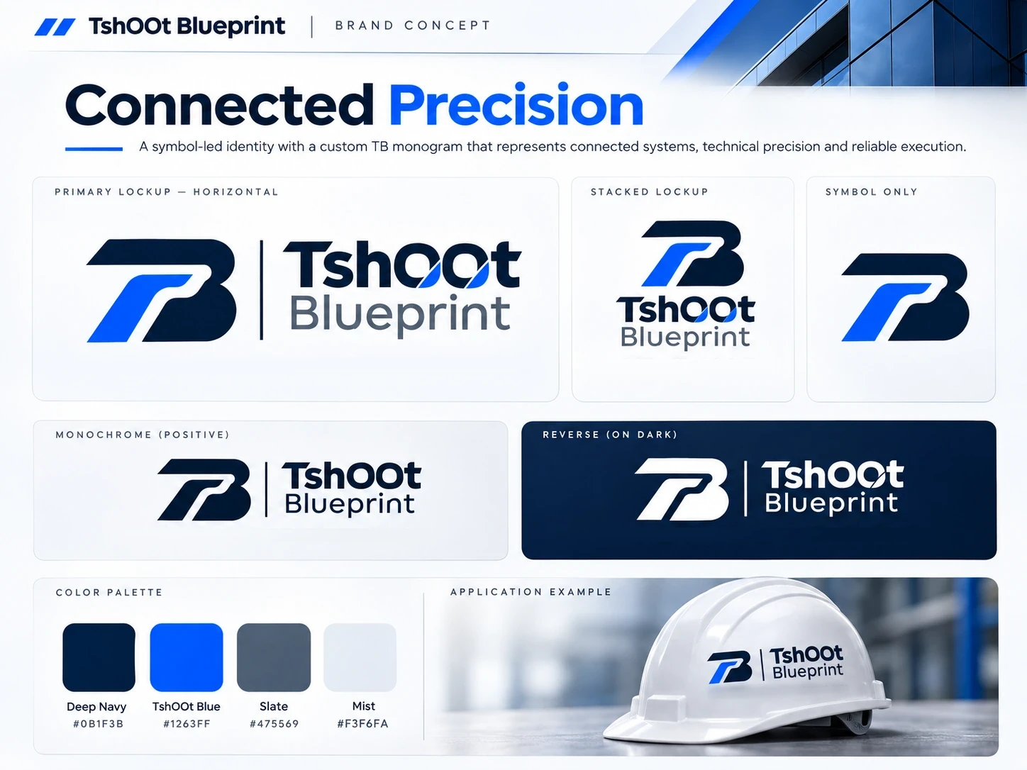
Concept exploration, closest to the selected direction
Connected precision
A custom TB monogram with a thin divider. Its symbol and divider are the ones that reached the selected direction.
Concept exploration
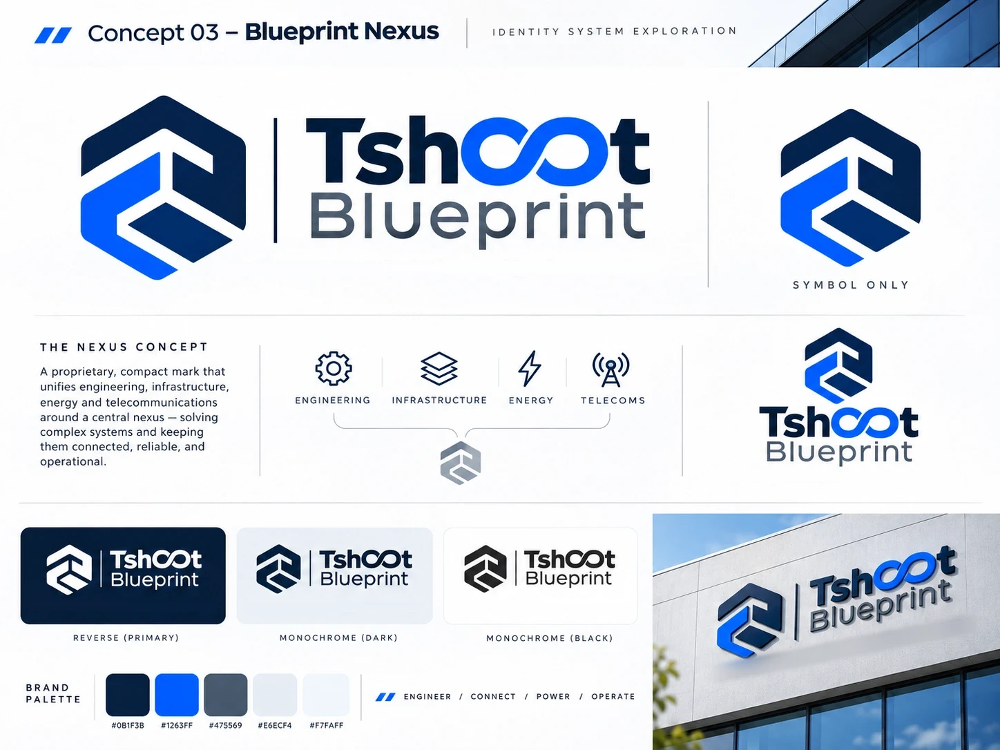
Blueprint nexus
A hexagonal symbol gathering the four sectors around one centre, with a looped letter O.
The helmet and building signage on these boards are illustrative mockups made while exploring. None of them is a photograph of a real installation.
The solution
A recognisable structural mark
The selected emblem is defined by a broad structural top beam, a rounded B-like silhouette and a blue ascending pathway. Its most important detail is the light channel carved between those forms: the negative space gives the mark its movement, legibility and distinctive balance.
The symbol works as a strong focal point while remaining visually connected to the wordmark beside it.
- 1
A broad structural top beam
The long beam sets the mass and the direction of the mark.
- 2
A channel of negative space
The light gap between the forms gives the mark its movement and keeps it legible.
- 3
An ascending blue path
The one bright element, rising through the structure.
- 4
A thin vertical divider
It separates symbol and lettering while letting them work as one identity.
- 5
A diagonal cut in the second O
It echoes the direction of the emblem without repeating its shape.
- 6
The industry descriptor
Energy Industry Telecommunications, aligned with the lettering and held inside the wordmark width.
The wordmark
Designed to belong together
TshOOt is set as the primary name, with Blueprint providing a calmer second line. A diagonal intervention in the second O echoes the directional character of the emblem without duplicating its shape.
The final layout uses a thin divider to separate symbol and lettering while allowing them to operate as one identity. The small descriptor, Energy Industry Telecommunications, adds immediate sector context beneath the name.
- Hierarchy
- TshOOt first, Blueprint second
- Detail
- A diagonal cut in the second O
- Descriptor
- Aligned with the lettering, inside the wordmark width

Colour system
Technical without feeling generic
Deep navy brings stability and seriousness. Electric blue creates contrast and draws attention to the movement inside the symbol. A cool slate tone lets the supporting typography remain secondary.
An alternate direction referencing the original red and green palette was explored before the navy-and-blue composition was selected.
- Deep navy#0B1F3B
- Electric blue#1263FF
- Slate#475569
- White#FFFFFF
Approximate working references from the exploration boards, not a specification.
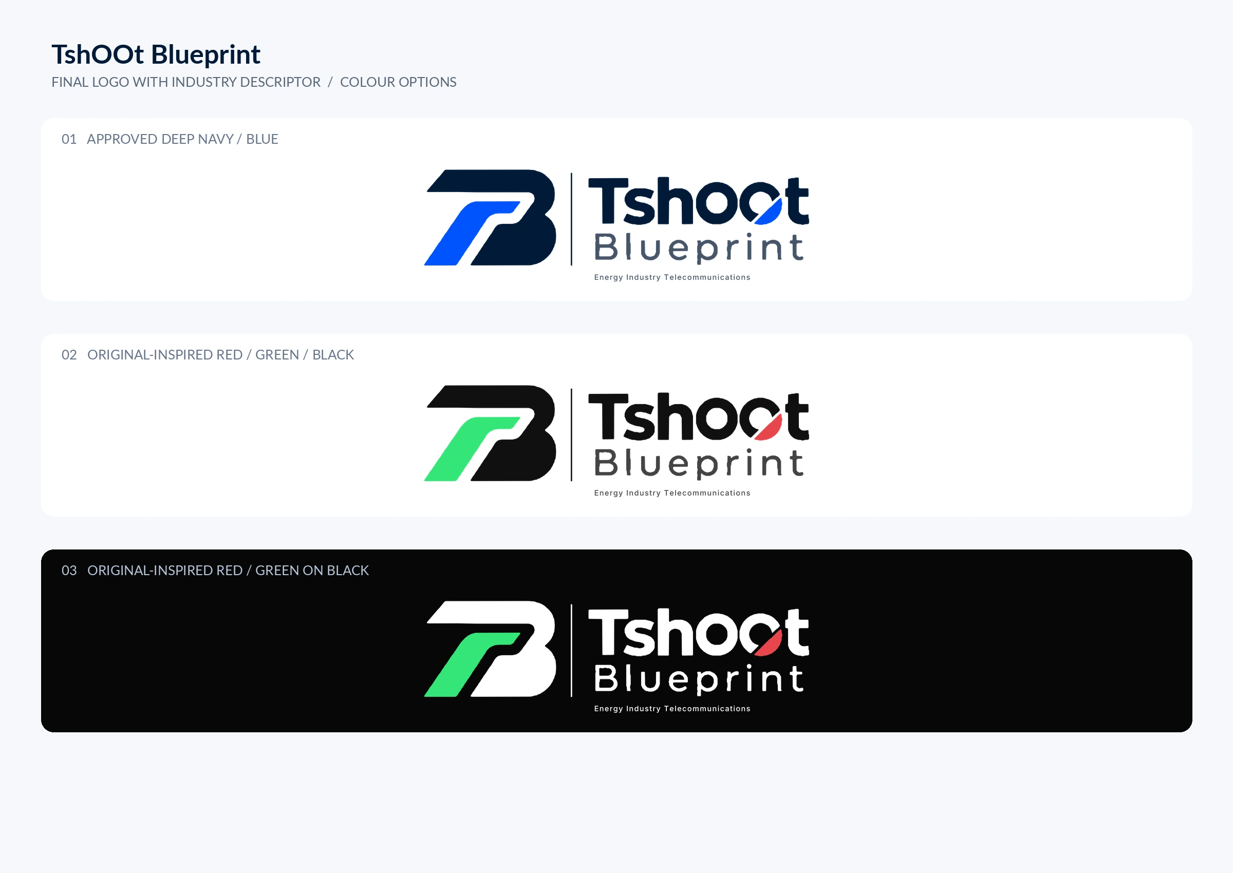
Selected direction
Selected visual identity
The final selected composition brings a clearer hierarchy to the identity: one structural symbol, a purposefully refined wordmark and a compact industry descriptor. The client selected this direction through the review process and approved its final visual composition.
The project demonstrates how reduction, geometry and typographic restraint can create a stronger foundation for a technically complex brand.

Complex business. Clear identity.
Reidify builds visual systems that make ambitious ideas easier to recognise and understand.